Monday, October 26, 2020

China Republic stamps : 04 Dr Sun Yat-sen 6

5 cents

for the 5 cents stamp in the 1st Sun Yat-sen series, there are not less then 5 different types.
In the 'narrow' version, we can find subtype A, C and D - and in the 'wide' version, subtypes A, B, C, D and E.

4 spots, to spot the differences

To find the different subtypes, we have to look at 4 different places, the two square frames on the top, and the square frame on the left bottom.


Picture 1 : subtype A, B and E depends on the bottom frame line of the top square.
In A (also in C and D) it is intact. In B and E it is partly or complete broken.
In the picture above, the line appears thinner towards the end.
The second 'check' will show it is a subtype E.

Picture 2 shows the 'FUN' sign (fun = cent). Subtype C has an intact 'fun' sign, subtype D a broken 'fun' sign.
The catalog mentions a 'broken hook' for this type.
I did not find any copy with this difference, but I found a stamp where the other stroke is open at the bottom and not closed like all other ones.
Maybe it's  just an accidental error or a plate flaw?

intact 'hook' but open left stroke ?

The differences mentioned above, are in combination with specific variations at the bottom of the stamp, as shown below:

Picture 3 is in combination with picture 1 and 2:
For subtype A, not only the frame line top has to be intact, also the vertical lines at the bottom of the pillar need to be regular.
For subtype B and E the top line is thin or partly missing, but B has a regular set of vertical lines below the pillar, while subtype E misses one vertical line in the row (see picture above).

For both subtypes C and D, the 'fun' sign is potentially intact of broken, but the series of vertical lines below the pillar are short and thick on the left, and regular from the middle to the right.
Best is to check this part first, before looking to the (less) 'fun' part.

Once determinated the subtypes, look if the stamp belongs to the 'narrow' or the 'wide' group.
The narrow group knows subtypes A, C and D - the wide group has all 5 subtypes.
Narrow subtype D is the rarest.

to be continued ...

Sunday, October 25, 2020

China Republic stamps : 04 Dr Sun Yat-sen 5

4 cents

I have to admit that the different types of this issue are not easy to find.
No wonder, only the chinese catalog mentions them.

For the 4 cents, luckily there are only 2 subtypes
Subtypes A and B are found in the 'narrow' issues - the 'wide' issue, has only type B.
Now the problem with this issue is, that the 'wide' version nearly is wider than the 'narrow' version...
But no panic...

In the 'wide' version, there is a tiny upright line from the right value tablet into the right column.
This is a small line, not always visibile if the stamp is cancelled.

tiny upright line in the right frame

The narrow version does not show this extra line.

For the difference between type A (early prints) and type B (later prints), we need to look at the left ornament.

type A or B ?

Again, it is not easy to see on cancelled stamps, as the differences are small.
In type A (only narrow version)
- the two horizontal lines on top of each other, are short and long (see 1)
- above the right end of the horizontal line there are no extra dots (see 2)

In type B (later narrow versions and wide version)
- the two horizontal lines on top of each other have the same length (see 1)
- above the right end of the horizontal line there are 2 extra dots (see 2)

Good luck in finding the different types.

Finally I found a copy with a scratch in the right frame.
The catalog does not mention it, so I wonder if it is a plate flaw that occurs on other stamps too, or if it is just an 'accidental' error.

plate flaw or accidental error?

To be continued ...

Monday, October 19, 2020

China Republic stamps : 04 Dr Sun Yat-sen 4

The second London printing of the Sun Yat-sen stamps that were issued between 1931 and 1937 have a special peculiarity.
Prior to 1933 a wet-paper printing proces was used. This resulted in shrinkage of the paper and therefore the image is 1 to 1.5 mm narrower than the later dry-printing issues.

above : dry-printing process : broad image
below : wet-paper printing : narrow image

In general, the average width of the image is 19 mm. Smaller images are to be considered as 'narrow', wider as 'broad'. In most cases, the narrow image is higher valuated than the broad one.

2 cents

For most collectors, this difference is the deepest level to sort out their stamps.
But why stop, if you can go deeper...
According the chinese catalog, there are 3 subtypes of the 2 cent stamp.

subtype A

has a retouched outer circle


the shoulder has an incomplete line
underneath the collar


subtype B


the outer circle is also retouched


the shoulder has no incomplete line
underneath the collar no more


subtype C


the outer circle is now complete

there is no broken line
underneath thecollar


Other differences can be found in the YU-chararcter (5th character from the right).
(yóu or yu)


The 'waffel' shape is in the A-type more like squares - in type B and C the right border looks like two hooks. The first image is a type A - as it is the 'narrow' version, which only has the A type.

In the 'narrow' version, only types A are known (early printings).
In the 'broad' version (later printings) all 3 types occur (type A is more rare)

to be continued ...

Saturday, October 17, 2020

China Republic stamps : 04 Dr Sun Yat-sen 3

Other values in the Dr. Sun Yat-sen series of 1931-37 can be confused with other issues.  Here, a simple example of the different issues :

A and B : 1931-37 issue. A with double circle in the sun (1st London printing) and B with dark circle in the sun (2nd London printing).  Both types belong to this series.
C : 2 $ issue - 1931-37 issue is blue / yellow-brown - but the series were extended in 1945-46 with this olive-green 2$ stamp. The stamp shown is part of the 1st series, but were added later.
D : different design (2nd design) - not with Corithinan columns but flower ornaments.
These stamps belong to another series.

2 ct to 2 $

If we consider the 'double circle' issue as the first issue and the 'full or dark circle' as the second issue, than we can already devide the following stamps into two groups.

2 ct double circle and full circle

The 'double circle' issue is the easiest to recognise.
This issue has 7 stamps: 1 - 2 - 4 and 20 cents; 1 - 2 and 5 $.
Only the one cent (see previous post) has two different types.

double circle stamps

All other values and/or colours come with a full circle - or with another design in the frame.

to be continued ...

Friday, October 16, 2020

China Republic stamps : 04 Dr Sun Yat-sen 2

In my previous post I started a topic on the first series of dr. Sun Yat-sen stamps that were issued to honour the new chinese gouvernment.

There was a  set of stamp in 1912, depicting Sun Yat-sen to commemorate the chinese revolution.
Although Sun Yat-sen died in 1925, it lasted till 1931 before the first new set of stamps of Sun Yat-sen were issued. 

The stamps were printed in London, and as soon as they were arrived, an error in the flag was noticed.
A new order was made, and the first print was kept in stock. In the end of 1931 the stamps were sold to the public.

The stamps were issued, but a new set of 'corrected' stamps were ordered in London (2nd. printing).
above 1st London printing (double circle)
below 2nd London printing (dark circle)

Since both issues were distributed at the same time, most catalogs mention them together.
But there are more things to discover in this set of 11 stamps!

All stamps were issued in sheets of 400 stamps - a left pane of 10 x 20 stamps and a right pane of 10 x 20 stamps.
Distriubuted per 200 for the cent values (one pane) and per 50 for the dollar values (1/8 pane).

In this 1931-1937 issue, all values come without decimals for the cent values.
The dollar values were extended with 5 stamps in 1945-46.

1 cent - orange

The one cent orange, comes with a double circle - not with the full circle.

Sun Yat-sen 1 cent 1931

Here there are two different types (probably left and right pane).
The difference is difficult to see, but a magnifier will do the work for you.

Type A and Type B

In one printing, the horizontal lines under the chinese characters is intact, all lines touch the left frame, and the squares forming this line are all complete.
In the other printing, one of the lines do not reach until the left frame, or, one of the squares is incomplete.

type A : closed frame
type B : open frame

Both stamps have the same value, but it is nice to search for two different types of course.

to be continued...

Thursday, October 15, 2020

China Republic stamps : 04 Dr Sun Yat-sen 1

Dr. Sun Yat-sen is without any doubt, one of the most important persons in the history of both China (PR) as for the Republic of China (Taiwan).

Dr Sun Yat-sen at younger age


At a young age, after fisishing elementary school, he moved to Hawai, where he soon lived together with his brother in Honolulu. Here he came in contact with western ideas on medicine and even with christianity, he also learned to speak English.
Because of his 'elaborated' interest in christianity, his brother sent him back to mainland China.
At the age of 17, Sun and his youth friend witnessed local villagers worshipping a local god 'Beiji' and the use of ancient and insufficient healing methods. After destroying the temple, they wer forced to flee to the more 'liberal' Hong Kong.
Whilst studying in Hong Kong, he soon enrolled at the newly opened Hong Kong School of Medicine for Chinese, now known as the Hong Kong University.

Hong Kong School of Medicine for Chinese 1912

Also here he had difficulties adapting to the old-fashioned and stubborn way of thinking, that was common for the whole Chinese society under the Imperial system of the Qing dynasty.
Soon he started to develop his political and filosophical ideas, which forced him many times to move aboad to avoid being arrested.
He led, or had a hand in many uprisings between 1895 and 1911. Although he was in the United States in 1911, the Qing dynasty came to and end and soon, Sun returned to China.
He became the first provisional president of the newly formed republic, but soon gave power to Yuan Shikai.

The emission of 1931-37 (plus some additional dollar values in 1945-46 have the same design: Corinthian columns left and right of the central image of Sun Yat-sen.

1931-37 dr. Sun Yat-sen design

to be continued ...

Monday, October 5, 2020

China Republic stamps : 03 Hall of Classics issue

Hall of Classics

In the 1913 and 1923 stamp series, there are 3 designs.
The Junk boat and the rice field worker, were discussed in previous posts.
The last design is that of the Hall of Classics (Hall of Culture in Bejing). This design was used for the higher (dollar) issues.

Again the 1923 design is significantly different than the 1913 version.
The most obvious difference is the double line under the country name in 1913, replaced by a single line only in the 1923 version.

1913 double lines
1923 single line

More differences are :
1: dotted sky in 1913 becomes a lined sky in 1923.
2: the tree left and right from the temple are worked out realistically in the redesigned version
3: the path to the hall door is broad in 1913, and narrow in the 1923 version.

It is way more difficult to see the differences between both 1913 printings. 

1913 London printing

For the London printing, we in the middle tower a rectangular shape. Compared to the later 1923 Bejing printing, this rectangle is smaller.
The leafs of the three right, are rather fuzzy in the London printing.
In the right doorway, we see a T-shaped figure.
The path towards the doorway is brighter in the 1913 version than in the 1923 version.

1913 Bejing printing

The panel in the middle tower, has rounded corners, compared to the London print and the later version.
In the Bejing printing, the leafs of the three, right of the building are 5 clear spots.
Looking to the right doorway, we see a Y-shaped  figure.
Compared to the London version, the path to the door is darker shaded


1923 Bejing printing

Compared to the 1913 version, here we see the middle doorway has an uninterrupted figure of two connected T's (TT).
In the 1913 version we can see two vertical lines and one horizontal line, clearly separated from eachother.
In the right doorway, there's no T or Y-shaped figure.

The most valuable set, is the 1913 Bejing printing, followed by the 1913 London printing.
The 1923 is the most common set.

1923 stamps

to be continued...

Sunday, October 4, 2020

China Republic stamps : 02 Rice field worker 2

Apart from the 12 differences I presented in my previous post, there are two more, easy to recognise differences in the country name.

The text is written from right to left on the stamp.
In western reading direction it becomes : 中 華 民 國 郵 政  or "Zhōng huá mín guó yóu zhèng"(Republic of China post office ).
The diffences between the stamps can be found in the 4th and 5th character from the right.

different characters

At least this is what is mentionned in the catalogs.
A closer look at the 3 types leads me to the following 6 differences:

1. 中 (Zhóng) - not mentioned in the catalog

1st character "zhóng"

The central vertical stroke is flattened in the 1913 version, where it's rounded in the 1923 version.
In the 1913 London printing, the bottom of this vertical stroke is cut diagonally and pointed.
The 1913 Bejing printing shows a vertical stroke that ends horizontally at the bottom.
Both of above printings have a rather bold vertical stroke.
For the 1923 version, the central vertical stroke is a slimmer, the top is rounded and the bottom is pointed.  This vertical stroke nearly touches the border frame on both sides.

In the 1913 London printing, the top horizontal stroke, matches almost in the left corner, with the left vertical stoke. The top of this vertical stroke points outwards to the left.
The 1913 Bejing printing shows the same 'corner' but perfectly matching.
The 1923 Bejing printing has a corner where both strokes don't meet in one point, as the vertical stroke ends higher and is not pointing outwards.

2. 華 (huá) - not mentioned in the catalog

2nd character "huá"

Here we see that the 1913 version  has a central vertical stroke that does not touch the border frame at the bottom, and a 1923 version where this stroke touches the border frame.
The bottom horizontal stroke is longer in the 1923 version, compared to the 1913 stamps.

3. 民 (mín) - not mentioned in the catalog

3rd character "mín"

Also this is not mentioned in the catalog, although it's clear that this character is wide in the 1913 version and more compressed in the 1923 version.
The diagonal stroke touches the border frame in 1923, but not in the 1913 version.
The top part of this character has a triangular shape in 1913 and is square in the later version.
The diagonal stroke is bisected by a horizontal stroke that touches the left stroke in 1923 but does not touch that stroke in 1913

4. 國 (guó or kuó)

4th character "guó"


This difference is mentioned in the chinese catalog.
This character looks like a 'box', the differences can be see in the top left corner.
1913 London print : horizontal and vertical stroke almost meet eachother in straight strokes.
1913 Bejing print : both strokes end in a left upwards  way
1923 Bejing print : both strokes are straight again, but there is a clear gap and 'open' corner

In the stamp I have, one of the small strokes in the 'box', leaves this box in the 1913 London printing.
I could not find any extra info on this, so I'm not sure if it's common or accidental.


In both Bejing printings, all strokes within the 'box' remain inside.

5. 郵 (yóu or yu) - partly mentioned in the catalog

Another described difference in the chinese catalog is concerning the 5th character ''you".
At least, a 'small' difference is mentioned, where an 'obvious' difference is not listed.


5th difference "yóu"

The 1923 print is clearly more compressed that the 1913 version. The character that looks like a 'B' is way more flat in the last version, compared to the 1913 version. This difference is not mentioned in the catalog.
A difference that is way more difficult to see is the small horizontal stroke in the left side of the character.
This small stroke is triangular in the 1913 London printing, straight and parallel in the 1913 Bejing printing, and upwards and attached to the vertical stroke, in the 1923 printing.

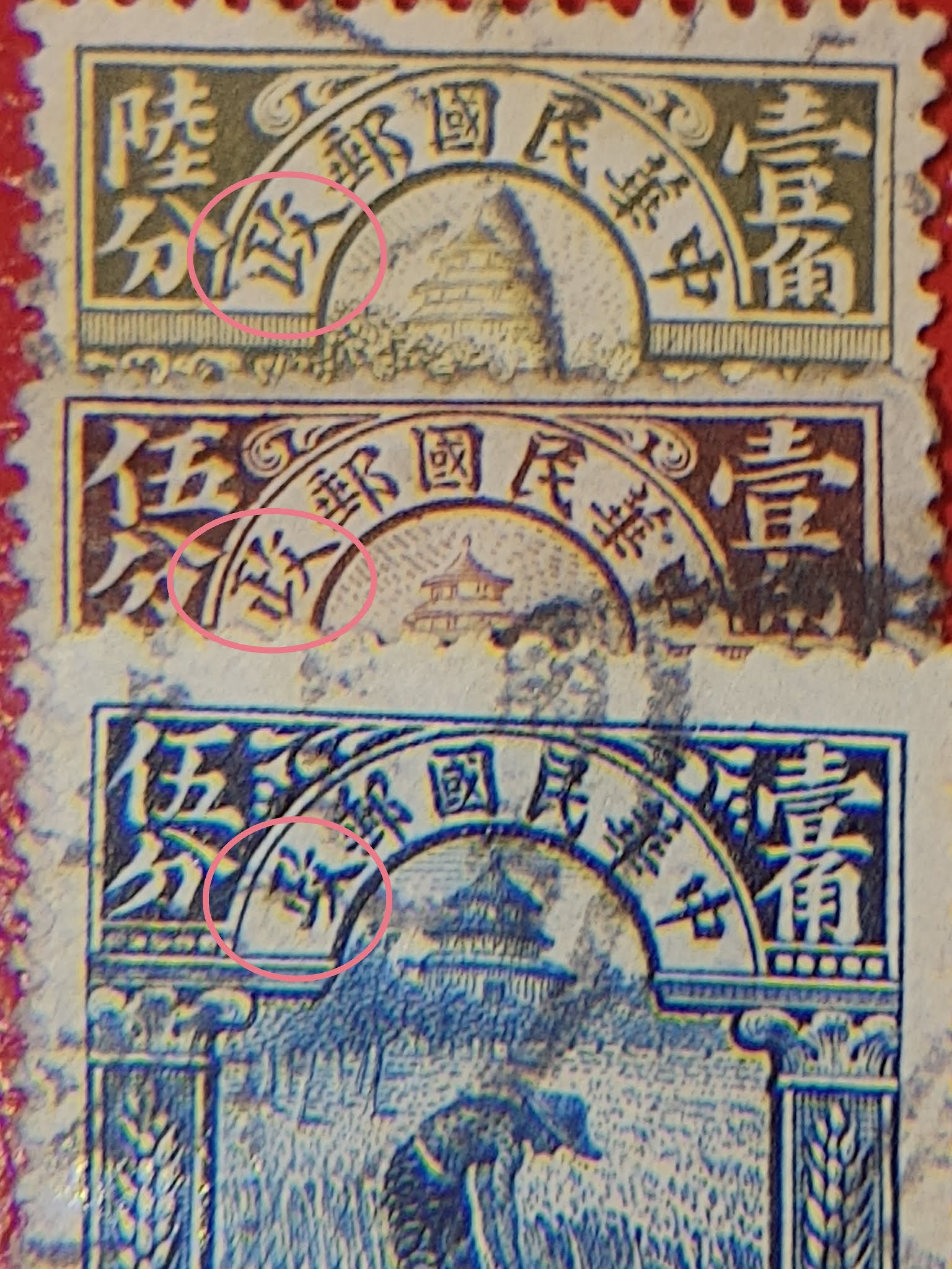
6. 政 (zhèng) - not mentioned in the catalog

6th character "zhèng"

Here, the most left vertical stroke, meets the vertical stroke at the bottom, forming a 'corner'.
This is only in the 1913 version, as in the 1923 version both strokes do not meet in a 'corner' but form an inverted "T"
The small vertical stroke on the right side looks like a 'thumbtack' in 1913, and like a 'comma' in 1923.

The obvious differences will make it easy to define whether your stamp is from the 1st printing (London or Bejing) or 2nd (Bejing) printing.
But the differences metioned in several catalogs are - in my opinion -  not the most 'easy to find' differences.
I hope this article adds to find more differences or helps to determinate your stamps.

to be continued ...

Saturday, October 3, 2020

China Republic stamps : 02 Rice field worker 1

Rice field worker

In the sets of 1913 and 1923, there are 3 images depicted.
I presented already the Junk boat (values 1/2 cent to 10 cents) and in this second series, I will show the values between 15 and 50 cents. Later on I will aso present the dollar values.

Similar to the Junk stamps, there are 3 printings (printing 1 and 2 are from 1913 (London and Bejing) - and printing 3 (modified design - Bejing).

There are many easy to detect differences between the 3 types. On cancelled stamps, some details might be hidden so a listing of the specific characteristics.

Left 1913 printing - right 1923 printing

Differences 1, 2 and 3

1st diffence is above the ornament left and right. In the 1913 printing, the horizontal frame is filled with lines and continue underneath the country's name. In the 1923 printing, this horizontal frame is shorter and filled with circles.

2nd difference is in the background of the vertical ornament left and right from the rice field worker.
In the first issue, this background is ligned, where in the second issue it's squared.

3rd diffethere rence can be found in the two dots under the 'ts' in Cts.
In 1913 there are two round dots, in 1913 there are two squares

Differences 4, 5 and 6

4th difference can be seen in the ornament on the top. This ends in two dots in the 1923 version.
In 1913 there are no dots.

5th difference is in the shading of the sky. In the first issue, the shading is diagonal, in the redesigned version it becomes horizontal.

6the difference is the rice field itself. In the 1913 version, the rice field looks like randomly placed points. In 1923, the top of the rice field is more organised and the dots follow certain lines.

differences 7 to 11

Difference 7 is in the pants of the rice field worker. The first issue, the pants end in a white band. The renewed version, shows a totally coloured pair of pants.

For diffence 8, we first see a difference in the London printing (top stamp), the first Bejing printing (middle stamp) and the 2nd Bejing (bottom stamp).
A closer look to this and other differences :

A : London 1913.
B : Bejing 1913
C : Bejing 1923
The bottom frame of the head of the rice field worker is more or less straight (A). In the Bejing issue it's way more curved and in the 1923 version (C) the outer lines are more pronounced.

For the 9th difference, we need to look at the trees (A and B) - the trunks are fully coloured and the shadow lines go in all directions.
In the redesigned version (C) the trunks are white with a black shadow, all shadows point in the same direction.

Differences 10 and 11 are difficult to see.

For the 10th difference, the left foot of the man touches the line on the floor (A), there is also a white line at the left heel. Second image has a left foot that doesn't touch the line on the floor, nore is there a white line at the left heel (B).  The 3rd image (C) has a left foot that touches the lines on the floor again, but at the left heel, there also isn't a white line.

11th difference is in the sickle that the man used.  This touches the stalks. In the 1913 London version the sickle is roughly designed, where in the 1923 Bejing version it's clearly designed.
In the 1913 Bejing version (B) the sickle doesn't touch the stalks.

Final difference in the central image is the temple.
In the 1913 version, the temple has no door. This is corrected in the 1923 version.

1913 without door, 1923 with door

to be continued ...

Friday, October 2, 2020

China Republic stamps : 01 Junk series d - regional overprints 2

Last two possible overprints on the Junk boat series are for 2 provinces central and south of China:

Szechwan or Sichuan province

Szechwan / Sichuan overprint

Only  3 stamps got the Szechwan / Sichuan overprint : 1 and 5 cent (Junk) and later 30 cents (rice field worker)

Sichuan overprint
 Yunnan province

Yunnan overprint


For the Yunnan province, the whole set of 1923 stamps get the overprint.

Yunnan overprint
to be continued ...