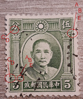
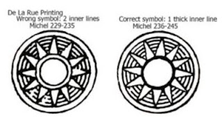
Apart from the 12 differences I presented in my previous post, there are two more, easy to recognise differences in the country name.
The text is written from right to left on the stamp.
In western reading direction it becomes : 中 華 民 國 郵 政 or "Zhōng huá mín guó yóu zhèng"(Republic of China post office ).
The diffences between the stamps can be found in the 4th and 5th character from the right.
 |
different characters
|
At least this is what is mentionned in the catalogs.
A closer look at the 3 types leads me to the following 6 differences:
1. 中 (Zhóng) - not mentioned in the catalog
 |
1st character "zhóng"
|
The central vertical stroke is flattened in the 1913 version, where it's rounded in the 1923 version.
In the 1913 London printing, the bottom of this vertical stroke is cut diagonally and pointed.
The 1913 Bejing printing shows a vertical stroke that ends horizontally at the bottom.
Both of above printings have a rather bold vertical stroke.
For the 1923 version, the central vertical stroke is a slimmer, the top is rounded and the bottom is pointed. This vertical stroke nearly touches the border frame on both sides.
In the 1913 London printing, the top horizontal stroke, matches almost in the left corner, with the left vertical stoke. The top of this vertical stroke points outwards to the left.
The 1913 Bejing printing shows the same 'corner' but perfectly matching.
The 1923 Bejing printing has a corner where both strokes don't meet in one point, as the vertical stroke ends higher and is not pointing outwards.
2. 華 (huá) - not mentioned in the catalog
 |
2nd character "huá"
|
Here we see that the 1913 version has a central vertical stroke that does not touch the border frame at the bottom, and a 1923 version where this stroke touches the border frame.
The bottom horizontal stroke is longer in the 1923 version, compared to the 1913 stamps.
3. 民 (mín) - not mentioned in the catalog
 |
3rd character "mín"
|
Also this is not mentioned in the catalog, although it's clear that this character is wide in the 1913 version and more compressed in the 1923 version.
The diagonal stroke touches the border frame in 1923, but not in the 1913 version.
The top part of this character has a triangular shape in 1913 and is square in the later version.
The diagonal stroke is bisected by a horizontal stroke that touches the left stroke in 1923 but does not touch that stroke in 1913
4. 國 (guó or kuó)
 |
4th character "guó"
|
This difference is mentioned in the chinese catalog.
This character looks like a 'box', the differences can be see in the top left corner.
1913 London print : horizontal and vertical stroke almost meet eachother in straight strokes.
1913 Bejing print : both strokes end in a left upwards way
1923 Bejing print : both strokes are straight again, but there is a clear gap and 'open' corner
In the stamp I have, one of the small strokes in the 'box', leaves this box in the 1913 London printing.
I could not find any extra info on this, so I'm not sure if it's common or accidental.
In both Bejing printings, all strokes within the 'box' remain inside.
5. 郵 (yóu or yu) - partly mentioned in the catalog
Another described difference in the chinese catalog is concerning the 5th character ''you".
At least, a 'small' difference is mentioned, where an 'obvious' difference is not listed.

|
5th difference "yóu"
|
The 1923 print is clearly more compressed that the 1913 version. The character that looks like a 'B' is way more flat in the last version, compared to the 1913 version. This difference is not mentioned in the catalog.
A difference that is way more difficult to see is the small horizontal stroke in the left side of the character.
This small stroke is triangular in the 1913 London printing, straight and parallel in the 1913 Bejing printing, and upwards and attached to the vertical stroke, in the 1923 printing.
6. 政 (zhèng) - not mentioned in the catalog
 |
6th character "zhèng"
|
Here, the most left vertical stroke, meets the vertical stroke at the bottom, forming a 'corner'.
This is only in the 1913 version, as in the 1923 version both strokes do not meet in a 'corner' but form an inverted "T"
The small vertical stroke on the right side looks like a 'thumbtack' in 1913, and like a 'comma' in 1923.
The obvious differences will make it easy to define whether your stamp is from the 1st printing (London or Bejing) or 2nd (Bejing) printing.
But the differences metioned in several catalogs are - in my opinion - not the most 'easy to find' differences.
I hope this article adds to find more differences or helps to determinate your stamps.
to be continued ...


